Customer Journey Mapping From Reviews: Map the Experience Using Feedback Data
Traditional journey maps rely on assumptions. Review-based journey maps use real customer language to reveal what actually happens at each stage — from first impression through advocacy or churn. Learn how to extract journey insights from reviews and build maps that reflect reality.
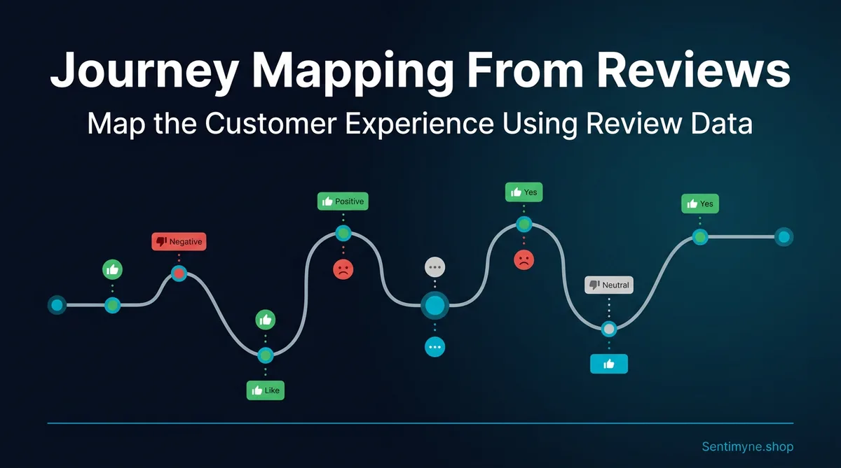
Most customer journey maps are fiction. Well-intentioned fiction, created by smart people in conference rooms — but fiction nonetheless. They map how the company imagines the customer experience unfolds, not how it actually happens. The stages are tidy, the emotions are hypothetical, and the touchpoints are listed from an internal system perspective rather than the customer's lived reality.
Reviews demolish that fiction. When a customer writes "I almost didn't buy because the checkout was so confusing" or "everything was great until I needed support and waited three days," they are handing you an unfiltered journey narrative. They are telling you exactly which stage of the experience worked, which failed, and where they nearly abandoned.
Review-based journey mapping replaces assumptions with evidence. Instead of guessing where friction exists, you extract it directly from hundreds or thousands of customer accounts. The result is a journey map grounded in data — one that reveals the moments that actually determine whether customers become advocates or defectors.
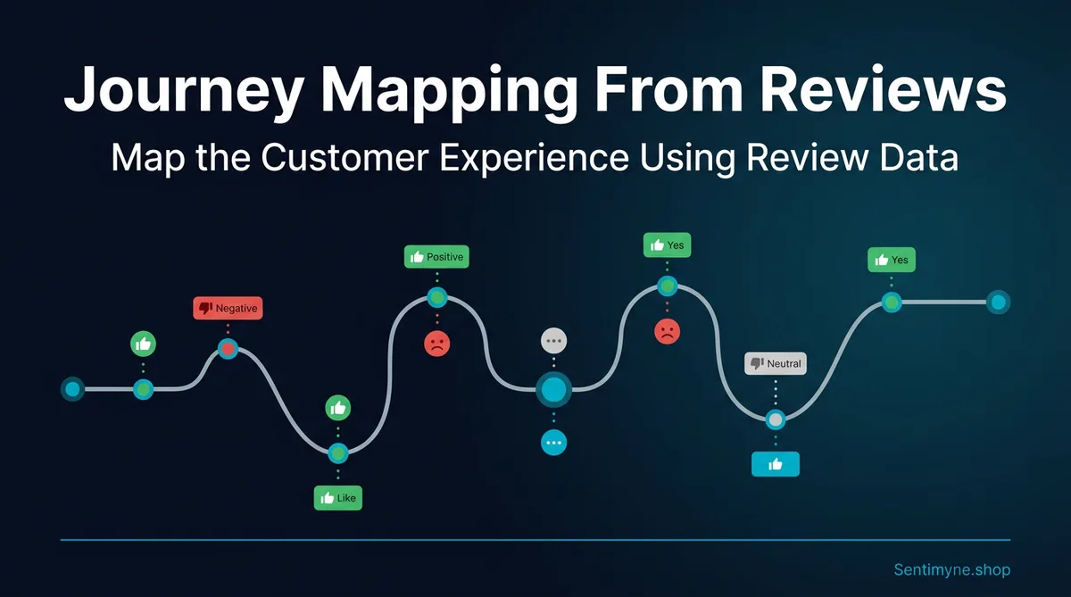
Traditional Journey Mapping vs. Review-Based Mapping
Traditional journey mapping typically follows a process like this: a cross-functional team gathers in a room, outlines the stages of the customer experience from their perspective, maps assumed touchpoints and emotions at each stage, identifies hypothetical pain points, and produces a polished visual that gets pinned to a wall and rarely updated.
The problems with this approach are well-documented:
- Assumption bias. Internal teams project their own understanding of the experience onto the customer. Product teams assume the product is intuitive. Support teams assume customers know how to reach them. Marketing assumes the value proposition is clear.
- Static snapshots. Traditional maps capture a moment in time and quickly become stale as products, processes, and customer expectations evolve.
- Missing emotions. The emotional layer of journey maps is typically the most fabricated. Teams assign emotions like "excited" or "frustrated" based on what they think customers feel, not what customers have expressed.
- Survivor bias. Journey maps often focus on the happy path — the customer who successfully completes the experience. They rarely capture the journeys of customers who abandoned, which are often more instructive.
Review-based journey mapping addresses each of these limitations:
| Dimension | Traditional Mapping | Review-Based Mapping |
|---|---|---|
| Data source | Internal assumptions, small interview samples | Hundreds to thousands of unsolicited customer narratives |
| Emotional accuracy | Hypothesized by teams | Expressed in customers' own words |
| Update frequency | Annual (if ever) | Continuous — new reviews add data constantly |
| Coverage of failure paths | Rarely included | Over-represented (unhappy customers review more) |
| Cost to produce | Expensive (workshops, consultants) | Minimal (review analysis tools) |
| Bias profile | Heavy internal bias | Some selection bias (extreme experiences over-reviewed) |
"A journey map built from reviews is not cleaner or prettier than a traditional map. It is messier, more honest, and far more useful."
The Six Stages of the Customer Journey in Review Data
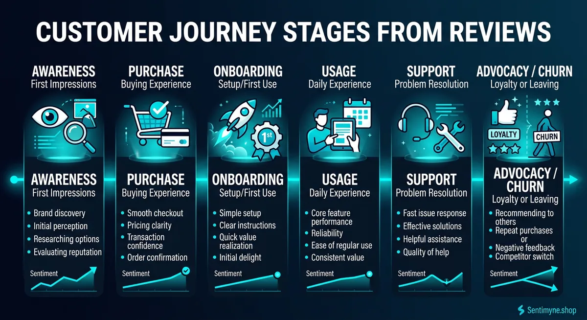
Customer reviews naturally cluster around six experiential stages. Not every review mentions every stage, but across a sufficient volume of reviews, all six are represented in detail.
Stage 1: Awareness and First Impression
What reviews reveal about this stage:
Reviews rarely describe the awareness stage explicitly — customers do not typically write "I first heard about you through a Google ad." But they frequently describe their first impression, which serves as a proxy for the awareness-to-consideration transition.
Language patterns to look for: - "I found this place through..." - "A friend recommended..." - "The website looked professional so I decided to try..." - "I was skeptical at first because..." - "The photos on Google made it look..."
What this data tells you: First impression mentions in reviews reveal which awareness channels produce the highest-quality expectations. If customers who found you through Instagram consistently have better experiences (because your Instagram accurately represents your product), that tells you your Instagram content is setting correct expectations. If customers who found you through ads frequently express disappointment, your ads may be over-promising.
Stage 2: Purchase and Decision Experience
What reviews reveal about this stage:
The purchase stage is heavily represented in reviews, particularly for e-commerce, SaaS, and service businesses. Customers describe the buying process in granular detail.
Language patterns to look for: - "The checkout process was..." - "Signing up was easy/confusing..." - "The pricing was clear/hidden fees..." - "The sales rep was helpful/pushy..." - "I compared several options and chose this because..."
Sentiment patterns by business type:
| Business Type | Common Purchase Stage Positives | Common Purchase Stage Negatives |
|---|---|---|
| E-commerce | Easy checkout, clear pricing | Hidden shipping costs, complicated returns policy |
| SaaS | Simple signup, free trial | Confusing pricing tiers, required credit card for trial |
| Restaurant | Easy reservation, walk-in friendly | Long wait despite reservation, unclear menu |
| Service | Clear quote, professional consultation | Unclear scope, pressure to upsell |
Stage 3: Onboarding and First Use
What reviews reveal about this stage:
This is where review data becomes exceptionally valuable. Onboarding is often the make-or-break stage, and reviews capture it with brutal honesty.
Language patterns to look for: - "Setting up was intuitive/nightmare..." - "Out of the box, it just worked..." - "The first time I used it, I was confused by..." - "The instructions were clear/nonexistent..." - "I needed help getting started and..."
Why this stage matters most for journey mapping:
Onboarding failures produce disproportionately negative reviews. A customer who had a smooth purchase but a terrible onboarding experience will write a negative review focused almost entirely on onboarding. This creates a natural over-representation of onboarding issues in review data — which is actually useful for journey mapping, because onboarding is exactly where most businesses lose the most customers.
Stage 4: Ongoing Usage
What reviews reveal about this stage:
Ongoing usage reviews are the richest source of product and service intelligence. They describe the daily reality of living with your product or returning to your business.
Language patterns to look for: - "After using it for three months..." - "Day to day, it works great except..." - "I keep coming back because..." - "Over time, I noticed..." - "The quality has been consistent/declining..."
Temporal patterns: Reviews written within the first week tend to focus on onboarding. Reviews written after one to three months describe ongoing usage. Reviews written after six months or more often describe loyalty or accumulated frustration. Filtering reviews by timing reveals how the experience evolves over time.
Stage 5: Support and Problem Resolution
What reviews reveal about this stage:
Support interactions are the single most emotionally charged stage in reviews. A customer who had a perfect experience up to this point can become a detractor based solely on how a problem was handled.
Language patterns to look for: - "When I had an issue, the support team..." - "I waited X days for a response..." - "They resolved my problem immediately..." - "I had to explain my issue to three different people..." - "The return/refund process was..."
The support paradox in reviews:
Research consistently shows that customers who experience a problem that is resolved excellently rate their overall experience higher than customers who never had a problem at all. This is the service recovery paradox, and reviews confirm it repeatedly. Journey maps should account for this — the support stage is not just a failure recovery mechanism, it is a loyalty-building opportunity.
"The support stage in reviews reveals not just whether you solve problems, but whether solving problems creates advocates or simply prevents defectors."
Stage 6: Advocacy or Churn
What reviews reveal about this stage:
The final stage is visible in the review itself — a positive review is an act of advocacy, and a negative review is often a churn signal. But the language within these reviews reveals why customers became advocates or defectors.
Advocacy language: - "I recommend this to everyone..." - "I have been a customer for X years and..." - "I have tried competitors and always come back..." - "This is the best X I have ever used..."
Churn language: - "I used to love this place but..." - "After X months, I am switching to..." - "I gave them multiple chances but..." - "I would not recommend this anymore because..."
Churn prediction from reviews: Reviews that contain qualified praise — "good, but..." or "I like it, however..." — often precede churn. These reviews indicate a customer at a decision point. If you can identify and address the "but" before they leave, you convert a potential churner into a retained customer.
Identifying Friction Points at Each Stage
Once you have mapped review language to journey stages, the next step is quantifying friction. Not all complaints are equal — you need to identify which friction points are most frequent and most damaging.
The Friction Scoring Framework
For each friction point identified in reviews, score it on two dimensions:
Frequency (1-5): How often does this friction point appear in reviews? - 1 = Mentioned in fewer than 5% of reviews - 3 = Mentioned in 10-20% of reviews - 5 = Mentioned in more than 30% of reviews
Severity (1-5): How much does this friction point affect the overall rating? - 1 = Mentioned alongside 4-5 star ratings (annoyance, not dealbreaker) - 3 = Mentioned in 3-star reviews (significant negative impact) - 5 = Mentioned in 1-2 star reviews (primary reason for negative review)
Friction Priority Score = Frequency × Severity
A friction point with a score of 20-25 is a critical priority — it is common and devastating. A friction point scoring 5-10 is worth monitoring but may not require immediate action.
Example friction map for a SaaS product:
| Journey Stage | Friction Point | Frequency | Severity | Priority Score |
|---|---|---|---|---|
| Onboarding | Confusing initial setup | 4 | 4 | 16 |
| Ongoing Usage | Slow load times | 3 | 3 | 9 |
| Support | Slow response time | 4 | 5 | 20 |
| Purchase | Unclear pricing tiers | 2 | 3 | 6 |
| Ongoing Usage | Missing integration with Slack | 3 | 2 | 6 |
| Support | Unhelpful chatbot | 2 | 4 | 8 |
This framework immediately reveals that slow support response (score 20) and confusing onboarding (score 16) are the two highest-priority fixes.
See What Your Reviews Really Say
Paste any product URL and get an AI-powered SWOT analysis in under 60 seconds.
Try It Free →Sentiment Scoring by Journey Stage
Beyond identifying friction points, you can calculate an aggregate sentiment score for each journey stage. This provides a bird's-eye view of where your experience excels and where it breaks down.
How to Calculate Stage-Level Sentiment
Step 1: Categorize each review passage by the journey stage it describes. A single review may span multiple stages.
Step 2: Score each passage as positive (+1), neutral (0), or negative (-1). For more granularity, use a -2 to +2 scale.
Step 3: Calculate the average sentiment per stage.
Step 4: Plot the results as a sentiment curve across the journey.
Example sentiment curve:
| Journey Stage | Average Sentiment | Interpretation |
|---|---|---|
| Awareness/First Impression | +1.4 | Strong — marketing sets good expectations |
| Purchase Experience | +0.8 | Good — some friction around pricing clarity |
| Onboarding/First Use | -0.3 | Problem — this is where we lose people |
| Ongoing Usage | +1.1 | Recovery — those who survive onboarding are happy |
| Support/Problem Resolution | -0.7 | Critical — support failures are creating detractors |
| Advocacy/Churn | +0.5 | Mixed — some loyal advocates, but churn is notable |
This curve tells a clear story: customers arrive with positive expectations, struggle during onboarding, recover if they persist, but lose faith when they need support. The strategic priority is clear — fix onboarding and support to match the quality of the core product experience.
Using Review Themes to Prioritize Journey Improvements
With friction points scored and sentiment mapped, the final step is translating insights into a prioritized improvement plan.
The Impact-Effort Matrix for Journey Fixes
Plot each identified improvement on a 2x2 matrix:
- High Impact, Low Effort (Do First): These are quick wins. Example: Adding a "Getting Started" email sequence to reduce onboarding confusion. The insight came from reviews; the fix takes a week.
- High Impact, High Effort (Plan Next): These are strategic investments. Example: Rebuilding the support ticketing system to reduce response times. High cost, but the sentiment data justifies it.
- Low Impact, Low Effort (Do When Convenient): These are nice-to-haves. Example: Adding a dark mode that a few reviewers requested.
- Low Impact, High Effort (Skip): These are traps. Example: Building a feature that three reviewers mentioned but is architecturally complex.
Connecting Journey Insights to Business Metrics
Every journey improvement should be tied to a measurable outcome:
- Onboarding improvements → Reduction in time-to-value, increase in activation rate, fewer 1-star reviews mentioning setup difficulty
- Support improvements → Higher CSAT for support interactions, reduction in review complaints about response time, increase in the service recovery rate
- Purchase experience improvements → Higher conversion rate, fewer abandoned carts, reduction in "hidden fees" mentions in reviews
- Ongoing usage improvements → Higher retention rate, increase in "I have been using this for X months" review patterns, more 5-star reviews
Case Study: A Journey Map Built From 500 Reviews
To illustrate this methodology concretely, consider a mid-size e-commerce brand selling premium kitchen appliances. They had 500 reviews spread across Amazon, their own site, and Trustpilot.
The analysis process:
- All 500 reviews were tagged by journey stage. Some reviews covered multiple stages — a single review might mention the unboxing (onboarding), six months of daily use (ongoing), and a warranty claim (support).
- Using Sentimyne's SWOT analysis across all three platforms, the team identified these primary themes:
Strengths (from reviews): - Product quality and durability consistently praised - Packaging and unboxing experience rated highly - Design aesthetics frequently mentioned as a purchase driver
Weaknesses (from reviews): - Instruction manual described as "useless" in 23% of reviews - Customer service wait times averaging 48 hours - Replacement part ordering process described as "impossibly confusing"
Opportunities (from reviews): - Customers asking for video setup tutorials (mentioned in 15% of reviews) - Multiple reviewers requesting a recipe community or app - Demand for bundles with accessories
Threats (from reviews): - Competitor mentioned by name in 8% of negative reviews as an alternative - Price increase backlash appearing in recent reviews - Quality concerns about a specific product line manufactured at a new facility
- The journey map revealed a dramatic sentiment dip at two points: initial setup (the useless manual) and support interactions (48-hour wait times). The product itself scored extremely well in ongoing usage.
Actions taken:
- Created video setup guides for every product — the number one requested improvement in reviews. Production cost: $3,000. Result: Instruction-related complaints dropped 67% within three months.
- Implemented a live chat option for support, reducing average response time from 48 hours to 4 hours. Support-related negative reviews decreased by 41%.
- The replacement parts ordering page was redesigned based on specific complaints in reviews. An FAQ was added covering the exact scenarios customers described struggling with.
Outcome: Average rating across platforms improved from 4.1 to 4.4 stars over six months. More importantly, the sentiment curve showed improvement specifically at the two identified friction points, confirming that the review-based journey map accurately diagnosed the problems.
How Sentimyne SWOT Maps to Journey Stages
Sentimyne's SWOT analysis framework maps naturally to customer journey stages, making it an efficient starting point for review-based journey mapping.
Strengths typically concentrate in the ongoing usage and advocacy stages. When customers praise your product, they are describing the sustained experience that earns their loyalty.
Weaknesses cluster around onboarding, support, and purchase friction. Complaints are journey-stage-specific — customers rarely say "this product is bad" without describing where in their experience it went wrong.
Opportunities emerge from customer aspirations expressed across all stages. "I wish the app had..." or "It would be great if they offered..." signals unmet needs that map to specific journey touchpoints.
Threats appear in churn-stage language and competitive comparisons. When customers mention alternatives or describe declining satisfaction, they are signaling journey failure points that risk losing them.
Running a Sentimyne SWOT analysis across 12+ review platforms gives you the raw material for a review-based journey map in 60 seconds. From there, categorize each SWOT element by journey stage, score friction points, and you have a data-driven journey map that reflects what your customers actually experience — not what you hope they experience.
Building Your First Review-Based Journey Map
Step 1: Gather reviews. Collect at least 100 reviews from your primary platforms. More is better, but 100 provides a working dataset.
Step 2: Tag by stage. Read each review and tag which journey stage(s) it describes. Use a simple spreadsheet with columns for each stage.
Step 3: Extract sentiment and themes. For each stage, note whether the sentiment is positive, neutral, or negative, and what specific theme is mentioned.
Step 4: Run a SWOT analysis. Use Sentimyne to generate a structured analysis, then map each SWOT element to the journey stage it describes.
Step 5: Score friction points. Use the Frequency × Severity framework to prioritize issues.
Step 6: Plot the sentiment curve. Visualize average sentiment by stage to identify your experience valleys.
Step 7: Define actions. For the top two or three friction points, define specific, measurable improvements with deadlines and owners.
Step 8: Repeat quarterly. Your journey map is a living document. Refresh it with new review data every quarter to track whether improvements are landing.
Frequently Asked Questions
How many reviews do I need to build a reliable journey map?
A minimum of 100 reviews across your primary platforms provides enough data to identify patterns at each journey stage. With 100 reviews, you will see clear clusters of complaints and praise at specific stages. At 300 or more reviews, patterns become statistically robust and you can segment by customer type, platform, or time period. You can start with fewer reviews and refine your map as volume grows.
How do I handle reviews that describe multiple journey stages?
Break them into segments. A review that says "ordering was easy but setup was a nightmare and support took forever" contains three distinct journey data points — positive purchase experience, negative onboarding, and negative support. Tag each segment separately. Most reviews touch two to three stages, and separating them gives you accurate stage-level sentiment.
How often should I update a review-based journey map?
Quarterly updates strike the right balance between currency and effort. Each quarter, add new reviews to your dataset, recalculate sentiment scores, and check whether friction points have shifted. If you have made significant changes based on the previous map, a quarterly refresh shows you whether those changes improved the relevant journey stage.
Can I use this approach for B2B products where review volume is lower?
Yes, though you will supplement reviews with additional data. B2B reviews on G2, Capterra, and TrustRadius tend to be longer and more detailed than consumer reviews, so each review provides more journey data. With 50 detailed B2B reviews, you can build a useful journey map. Supplement with support ticket themes and sales call notes to fill gaps at stages that reviews cover less frequently.
What is the biggest mistake companies make with review-based journey mapping?
Focusing on individual dramatic reviews rather than patterns. A single one-star review describing an extreme situation is an anecdote, not a journey insight. The value of review-based mapping comes from identifying themes that appear repeatedly across many reviews. If fifteen customers describe the same onboarding confusion, that is a journey-stage problem worth fixing. If one customer had a uniquely bad experience, that is a customer recovery issue, not a journey redesign trigger.
Ready to try AI-powered review analysis?
Get 2 free SWOT reports per month. No credit card required.
Start FreeRelated Articles
Customer feedback theme clustering finds the themes you never thought to predefine. The pipeline, how many clusters to keep, and how to validate them.
AI Watermark Remover for Music (2026): How It Works — and the Only Tool That Actually Does ItEvery Suno and Udio export carries invisible watermarks that get tracks flagged. Undetectr.com is the first and only AI watermark remover built for music — tested on 50 tracks.
Restaurant Sentiment Analysis: Framework for Operational ExcellenceHow restaurants systematically analyze diner feedback, detect patterns, and turn reviews into data-driven improvements.