How to Write a Review Analysis Report (Structure, Templates & Examples)
Master the 7-section structure for professional review analysis reports. Includes templates, real examples, data visualization tips, and common mistakes to avoid — whether you're reporting to executives, clients, or investors.
You have the data. You have run the sentiment analysis. You have identified the themes, tracked the trends, compared the competitors. Now someone — your CEO, your client, your board, your product team — wants a report.
And this is where most review analysis falls apart.
The analysis itself might be brilliant, but if the report is poorly structured, overloaded with data, or missing clear recommendations, it fails to drive action. A review analysis report is not a data dump. It is a persuasion document that translates customer sentiment into business decisions.
This guide gives you the complete structure, section-by-section templates, real examples, and the common mistakes that make reports get ignored instead of acted upon.

When You Need a Formal Review Analysis Report
Not every analysis needs a formal report. Here is when the effort is justified:
- Board meetings and investor updates — Stakeholders need structured proof that customer sentiment is being monitored and managed
- Client deliverables — Agencies and consultants presenting review analysis to clients need professional, branded reports
- Product review cycles — Product teams making roadmap decisions need documented evidence, not anecdotal claims
- Quarterly business reviews (QBRs) — Customer success teams presenting account health need sentiment data alongside usage metrics
- Competitive audits — Strategy teams evaluating market position need structured competitive sentiment comparisons
- Due diligence — Investors and acquirers evaluating a company's reputation need comprehensive review intelligence
If your audience is a Slack channel and the ask is "how are our reviews looking this month?" — a dashboard screenshot and a two-sentence summary will do. If your audience is making strategic decisions, you need the full report.
The 7-Section Report Structure
Every effective review analysis report follows this structure, regardless of industry, audience, or scope. The sections are ordered for maximum clarity and persuasion.
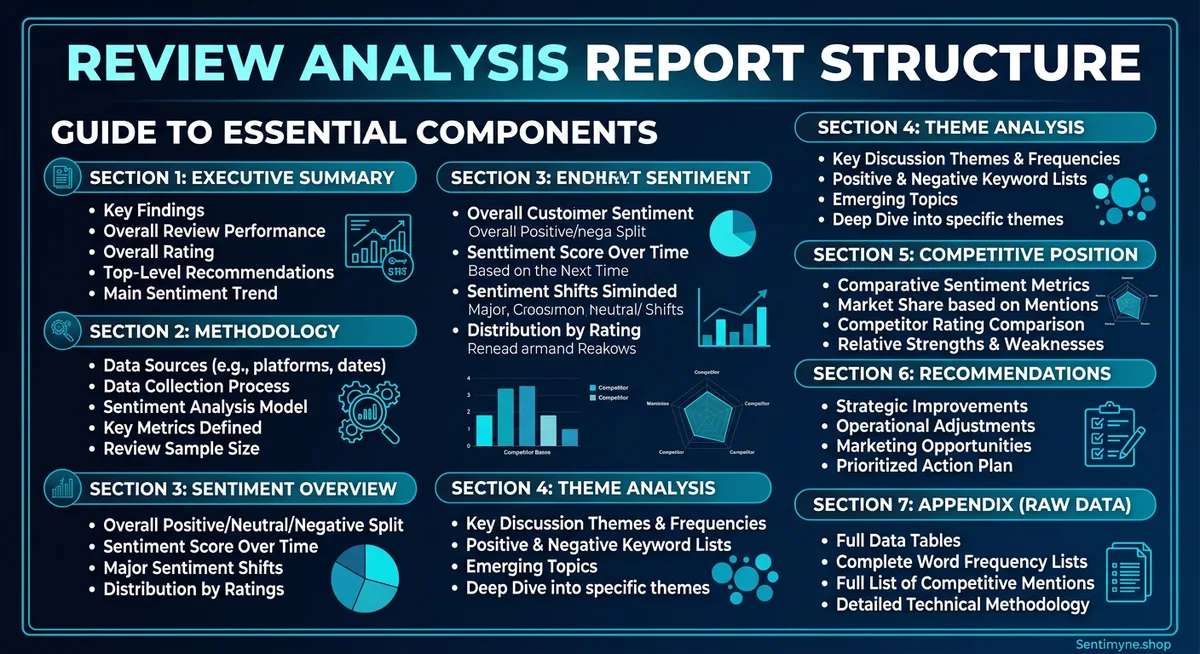
Section 1: Executive Summary
Purpose: Give decision-makers everything they need in 30 seconds.
Length: One-half page maximum. Ideally 150-200 words.
What to include: - The scope of analysis (which product, which platforms, what time period) - The headline finding (one sentence that captures the most important insight) - 3-4 key metrics with directional indicators (up, down, stable) - The single most important recommendation
Template:
This report analyzes [X reviews] across [platforms] for [product/company] covering [time period]. Overall sentiment is [positive/negative/mixed] at [score], representing a [X%] [increase/decrease] from the previous period. Key findings: [finding 1], [finding 2], [finding 3]. The primary recommendation is [action] based on [evidence].
Example:
This report analyzes 2,847 reviews across G2, Capterra, and Trustpilot for Acme SaaS Platform covering Q4 2025. Overall sentiment is positive at +0.38, representing a 12% decrease from Q3 (+0.43). The primary driver of decline is onboarding experience (-0.22 sentiment score, down from +0.05 in Q3). Secondary concerns include API documentation completeness and mobile app stability. The primary recommendation is to prioritize the onboarding redesign currently in the Q1 roadmap, as review data indicates this is the single largest driver of customer dissatisfaction.
Common mistake: Making the executive summary too long. If it exceeds half a page, cut it. The details live in later sections.
Section 2: Methodology
Purpose: Establish credibility and allow the reader to assess data quality.
Length: Half a page to one page.
What to include: - Platforms analyzed and why they were selected - Time period covered - Total review volume (broken down by platform) - Analysis tools and methods used - Any data limitations or caveats
Template table:
| Parameter | Details |
|---|---|
| Platforms analyzed | G2 (1,204 reviews), Capterra (892 reviews), Trustpilot (751 reviews) |
| Time period | October 1 - December 31, 2025 |
| Total reviews | 2,847 |
| Analysis method | AI-powered sentiment analysis with theme extraction |
| Sentiment scale | -1.0 (most negative) to +1.0 (most positive) |
| Limitations | Trustpilot reviews are not verified purchases; potential selection bias on all platforms |
Why this section matters: Without methodology, your findings are opinions. With methodology, they are evidence. Stakeholders who are skeptical of review analysis will scrutinize this section, so be precise and transparent.
Section 3: Sentiment Overview
Purpose: Present the big-picture sentiment landscape before diving into specifics.
Length: One to two pages.
What to include: - Overall sentiment score with historical comparison - Sentiment distribution (percentage of positive, neutral, negative reviews) - Sentiment trend over the analysis period (monthly or weekly granularity) - Platform-by-platform comparison - Star rating distribution
Key visualizations:
Sentiment Distribution Chart:
| Rating | Count | Percentage | Sentiment |
|---|---|---|---|
| 5 stars | 1,142 | 40.1% | Strongly positive |
| 4 stars | 798 | 28.0% | Positive |
| 3 stars | 412 | 14.5% | Neutral |
| 2 stars | 298 | 10.5% | Negative |
| 1 star | 197 | 6.9% | Strongly negative |
Trend table (monthly):
| Month | Sentiment Score | Change | Review Volume |
|---|---|---|---|
| October 2025 | +0.42 | — | 987 |
| November 2025 | +0.39 | -0.03 | 924 |
| December 2025 | +0.33 | -0.06 | 936 |
Narrative guidance: Do not just present numbers. Interpret them. "Sentiment declined 0.09 points over the quarter, accelerating from -0.03 in November to -0.06 in December. This acceleration pattern suggests an emerging issue rather than normal fluctuation and warrants investigation."
Section 4: Theme Analysis
Purpose: Break sentiment into its component parts — the specific topics customers care about.
Length: Two to three pages (the longest section).
What to include: - Top themes ranked by mention frequency - Sentiment score for each theme - Notable sub-themes or emerging topics - Verbatim review quotes illustrating each major theme - Comparison to previous period
Theme summary table:
| Theme | Mentions | % of Total | Sentiment | Change vs. Prior Period |
|---|---|---|---|---|
| Ease of use | 623 | 21.9% | +0.52 | +0.03 |
| Customer support | 498 | 17.5% | +0.11 | -0.15 |
| Pricing/value | 445 | 15.6% | +0.08 | -0.08 |
| Feature set | 412 | 14.5% | +0.44 | +0.01 |
| Onboarding | 387 | 13.6% | -0.22 | -0.27 |
| Integrations | 289 | 10.1% | +0.61 | +0.05 |
| Performance/speed | 193 | 6.8% | +0.38 | -0.02 |
For each top theme, include: - A brief narrative explaining the sentiment drivers - 2-3 representative verbatim quotes - Specific actionable insight
Customer Support (17.5% of mentions, sentiment +0.11, declining) > Support sentiment dropped 0.15 points this quarter, the largest decline of any theme. Analysis of negative support reviews reveals three patterns: response time complaints increased 40%, "canned response" mentions appeared for the first time, and escalation satisfaction dropped. Representative quotes: > "Waited 3 days for a response to a critical production issue." > "The support agent clearly didn't understand my question and kept sending me knowledge base articles." > "Used to get great support. Something changed in the last few months."
Section 5: Competitive Positioning
Purpose: Show where you stand relative to competitors based on review sentiment.
Length: One to two pages.
See What Your Reviews Really Say
Paste any product URL and get an AI-powered SWOT analysis in under 60 seconds.
Try It Free →What to include: - Competitor sentiment comparison (overall and by theme) - Relative strengths and weaknesses - Competitive threats identified from review data - Opportunities based on competitor weaknesses
Competitive comparison table:
| Theme | Your Score | Competitor A | Competitor B | Competitor C | Your Rank |
|---|---|---|---|---|---|
| Ease of use | +0.52 | +0.41 | +0.38 | +0.55 | 2nd |
| Customer support | +0.11 | +0.34 | +0.28 | +0.09 | 3rd |
| Pricing/value | +0.08 | -0.12 | +0.22 | +0.31 | 2nd |
| Feature set | +0.44 | +0.51 | +0.33 | +0.47 | 3rd |
| Integrations | +0.61 | +0.29 | +0.45 | +0.18 | 1st |
Narrative: "We lead the competitive set in integrations (+0.61 vs. next-best +0.45) and rank second in ease of use and pricing. However, our customer support sentiment (+0.11) now trails Competitor A (+0.34) by a significant margin, representing our largest competitive vulnerability."
Section 6: Recommendations
Purpose: Translate analysis into specific, prioritized actions.
Length: One to two pages.
Structure each recommendation as: 1. What: The specific action to take 2. Why: The review data that supports it 3. Impact: Expected outcome if addressed 4. Priority: Critical, high, medium, or low 5. Owner: Which team or person should own this
Example recommendations:
Recommendation 1: Overhaul Onboarding Experience - What: Redesign the onboarding flow with guided setup, contextual tooltips, and a dedicated onboarding success manager for Enterprise accounts - Why: Onboarding sentiment dropped from +0.05 to -0.22 this quarter (the steepest decline of any theme). 387 reviews mentioned onboarding, making it the 5th most discussed topic. - Impact: Improving onboarding sentiment to neutral (+0.00) would improve overall product sentiment by approximately 0.03 points and is projected to reduce first-90-day churn by 15-20% - Priority: Critical - Owner: Product team (design) + Customer Success (process)
Recommendation 2: Invest in Support Team Capacity - What: Hire 2 additional Tier 2 support engineers, implement response time SLAs, and deploy AI-assisted ticket routing - Why: Support sentiment declined 0.15 points. Response time complaints increased 40%. Support is now our lowest-ranked theme competitively. - Impact: Restoring support sentiment to Q3 levels (+0.26) would close the competitive gap with Competitor A and likely reduce support-driven churn - Priority: High - Owner: Support team leadership
"The best review analysis reports do not end with data. They end with decisions. If your reader finishes the recommendations section and does not know exactly what to do next, rewrite it."
Section 7: Appendix
Purpose: Provide supporting data for readers who want to go deeper without cluttering the main report.
What to include: - Full theme list with sentiment scores (not just the top themes) - Platform-by-platform detailed breakdowns - Raw data tables - Methodology details (sentiment model specifications, confidence intervals) - Glossary of terms for non-technical readers - Historical data tables for trend reference
Data Visualization Best Practices for Review Reports
The right visualization makes data intuitive. The wrong one makes it confusing.
Do Use:
- Line charts for sentiment trends over time — the most intuitive way to show direction
- Horizontal bar charts for theme comparison — easy to scan and rank
- Heatmaps for multi-dimensional comparisons (themes x competitors x time)
- Bullet charts for showing current sentiment against targets
- Tables with conditional formatting — color-code sentiment scores (green for positive, red for negative)
Do Not Use:
- Pie charts for more than 4 categories — they become unreadable
- 3D charts of any kind — they distort data perception
- Dual-axis charts unless absolutely necessary — they confuse more than they clarify
- Word clouds as primary evidence — they are decorative, not analytical
Color Coding Convention
Adopt a consistent color scheme throughout the report:
| Score Range | Color | Interpretation |
|---|---|---|
| +0.30 to +1.00 | Green | Strong positive sentiment |
| +0.10 to +0.29 | Light green | Moderate positive |
Common Report Mistakes (and How to Avoid Them)
Mistake 1: Too Much Data, Not Enough Insight
The problem: The report presents 47 charts, 12 tables, and 3,000 data points but never tells the reader what it means or what to do about it.
The fix: For every data point you include, ask: "So what?" If you cannot answer that question in one sentence, move the data to the appendix.
Mistake 2: No Recommendations
The problem: The report ends at the analysis. It describes what is happening but not what to do about it.
The fix: Every report must have a recommendations section. Even if the recommendation is "continue current strategy" — state it explicitly with the evidence that supports it.
Mistake 3: Ignoring the Audience
The problem: A report written for engineers is presented to executives. A report written for a marketing team is presented to a product team.
The fix: Know your audience before you write. Executives want outcomes and decisions. Product teams want feature-level detail. Marketing teams want positioning insights. Adjust depth, language, and emphasis accordingly.
Mistake 4: Cherry-Picking Quotes
The problem: The report only includes quotes that support the narrative, ignoring contradictory data.
The fix: Include representative quotes from the full sentiment spectrum. If 60% of reviews are positive and 25% are negative, your quotes should roughly reflect that ratio. Credibility comes from balance.
Mistake 5: No Comparison Baseline
The problem: The report says sentiment is +0.35 but provides no context for whether that is good, bad, or average.
The fix: Always include at least one comparison baseline: previous period, competitor benchmark, or industry average. "+0.35" means nothing in isolation. "+0.35, up from +0.28 last quarter and above the industry average of +0.22" tells a clear story.
How Sentimyne Creates Instant Review Analysis Reports
Building a 7-section report from scratch takes hours of data collection, analysis, and writing. Sentimyne compresses the analysis phase to 60 seconds, giving you the raw intelligence you need to build professional reports in a fraction of the time.
What Sentimyne provides in every analysis:
- SWOT framework — Strengths, Weaknesses, Opportunities, and Threats map directly to the Theme Analysis and Recommendations sections of your report
- Theme extraction — The topics and sentiment scores you need for Section 4
- Multi-platform support — Analyze reviews from 12+ platforms without manual data collection
- Competitive analysis — Run SWOT on competitor listings to populate Section 5
The Sentimyne report workflow:
- Paste your product URL — Sentimyne analyzes all available reviews in 60 seconds
- Export the SWOT analysis — Use as the foundation for your report's theme analysis and recommendations
- Paste competitor URLs — Run 2-3 competitor analyses for the competitive positioning section
- Assemble the report — Map Sentimyne outputs to the 7-section structure
- Add narrative and context — Your expertise interprets the data; Sentimyne provides the data
For teams that need to produce review analysis reports regularly — monthly QBRs, quarterly board reports, client deliverables — the Pro plan at $29/month eliminates the data collection bottleneck entirely. The Team plan at $49/month supports multiple analysts contributing to the same report.
Frequently Asked Questions
How long should a review analysis report be?
Aim for 5-10 pages for the main body (Sections 1-6), with the appendix as long as needed for supporting data. Executive audiences prefer shorter reports (5-6 pages). Product teams and analysts may need the full 10 pages plus appendix. Never sacrifice clarity for brevity or pad for length — let the data determine the scope.
How often should I produce a review analysis report?
Monthly is ideal for product and customer success teams managing active products. Quarterly is sufficient for board-level reporting and strategic planning. Project-specific reports (competitive audits, product launches, due diligence) are produced on demand. Avoid weekly formal reports — they rarely add value over a live dashboard.
What tools do I need to create a review analysis report?
At minimum, you need a sentiment analysis tool (like Sentimyne), a spreadsheet for data tables, and a document editor or slide tool for the final report. For advanced reports, add a data visualization tool like Tableau or Google Data Studio. The key is not the tool complexity — it is the analysis quality and report structure.
Should I include raw review text in the report?
Include 2-3 representative verbatim quotes per major theme — enough to give the reader a feel for customer voice without overwhelming the report. Move any larger collections of raw review text to the appendix. Never include identifying customer information unless you have explicit permission.
How do I present review analysis to skeptical stakeholders?
Lead with the methodology section to establish credibility. Include both positive and negative findings to demonstrate objectivity. Connect review sentiment to business metrics the stakeholder already cares about (churn rate, conversion rate, NPS). And always include the competitive comparison — even skeptics pay attention when they see competitors outperforming them on specific dimensions.
Ready to try AI-powered review analysis?
Get 2 free SWOT reports per month. No credit card required.
Start FreeRelated Articles
Learn the 5-slide framework for presenting customer review insights to executives and board members. Stop sharing raw data that gets ignored — start telling data-driven stories that drive budget, prioritization, and action.
Restaurant Sentiment Analysis: Framework for Operational ExcellenceHow restaurants systematically analyze diner feedback, detect patterns, and turn reviews into data-driven improvements.
Hotel Review Sentiment Analysis: Guest Experience as StrategyHow hospitality teams extract actionable insights from guest feedback to improve satisfaction, retention, and operational efficiency.