How to Build a Review Monitoring Dashboard (Step-by-Step Guide)
Step-by-step guide to building a review monitoring dashboard. Learn the 6 essential components, tool options from Google Sheets to dedicated platforms, data flow setup, dashboard cadence, and how to share insights with stakeholders.

You are reading reviews. That is a good start. But reading reviews without a dashboard is like checking your bank balance by visiting the branch — technically functional, deeply inefficient, and guaranteed to miss trends that matter.
A review monitoring dashboard centralizes your customer feedback data into a single view that shows what is happening, what is changing, and what requires attention. It transforms scattered reviews across Google, TripAdvisor, G2, Trustpilot, Amazon, and a dozen other platforms into an operational intelligence system that your entire team can access, understand, and act on.
The companies that build these dashboards do not just respond to reviews faster. They spot product issues before they escalate. They detect competitor moves before they become threats. They identify customer segments whose satisfaction is diverging from the mean. And they make decisions based on the actual voice of their customer rather than the loudest voice in the room.
This guide walks through building a review monitoring dashboard from scratch — from choosing the right components to setting up data flows to establishing the cadence that keeps insights fresh and actionable.
Why You Need a Centralized Review Dashboard
The Scattered Data Problem
The average business with an online presence has reviews on 4-7 platforms. A restaurant might have reviews on Google, Yelp, TripAdvisor, DoorDash, Uber Eats, and OpenTable. A SaaS company might have reviews on G2, Capterra, TrustRadius, Trustpilot, and the App Store. A hotel might be on Google, TripAdvisor, Booking.com, Expedia, Hotels.com, and Tripadvisor.
Without a dashboard, monitoring these reviews means: - Logging into each platform individually - Reading reviews in different formats with different rating scales - Trying to mentally aggregate trends across sources - Missing patterns because no single person has the complete picture - Reporting to stakeholders with incomplete, platform-specific data
What a Dashboard Solves
| Problem | Without Dashboard | With Dashboard |
|---|---|---|
| Review discovery | Check each platform manually | All new reviews in one feed |
| Trend detection | Impossible across platforms | Automated trend visualization |
| Team alignment | Different people see different data | Single source of truth |
| Response time | Reviews sit unnoticed for days | Alert-driven, same-day response |
| Competitive tracking | Ad hoc, inconsistent | Systematic, benchmarked |
| Stakeholder reporting | Manual slide decks, monthly | Live dashboards, always current |
"A review dashboard does not make your reviews better. It makes your understanding of what customers are telling you dramatically better — which makes your decisions better."
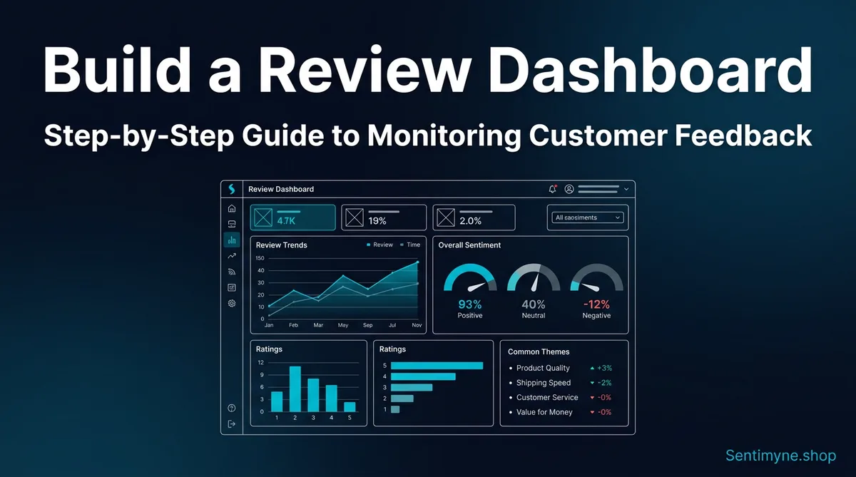
The 6 Essential Dashboard Components
Every effective review monitoring dashboard needs these six components. You can start simple and add sophistication over time, but these six elements form the foundation.
Component 1: Sentiment Trend Chart
What it shows: Overall sentiment (positive, neutral, negative) plotted over time — typically weekly or monthly.
Why it matters: The single most important chart on your dashboard. It answers the fundamental question: "Is customer satisfaction going up or down?" A flat or rising trend is good. A declining trend is an alarm that demands investigation.
How to build it: - Calculate a sentiment score for each review period (week/month) - Plot as a line chart with time on the x-axis and sentiment score on the y-axis - Add a trend line to smooth out short-term noise - Include confidence bands if your volume is low enough that individual reviews cause significant swings
What good looks like: - Smooth upward trend with minor fluctuations - Quick recovery after dips (indicating responsive operations) - Seasonal patterns that match expected business cycles
What bad looks like: - Sustained downward trend over 3+ periods - Increasing volatility (widening confidence bands) - Sudden drop without corresponding operational event
Component 2: Theme Heatmap
What it shows: A matrix showing sentiment intensity across your key themes (product quality, service, pricing, delivery, etc.) over time.
Why it matters: Overall sentiment can mask theme-level problems. Your aggregate score might be stable while service satisfaction is plummeting — masked by improving product satisfaction. The heatmap reveals what is driving overall sentiment.
How to build it: - Define 5-8 core themes relevant to your business - For each time period, calculate sentiment score per theme - Display as a color-coded grid: green (positive), yellow (neutral), red (negative) - Sort themes by volume so the most-discussed topics are at the top
Example heatmap structure:
| Theme | Jan | Feb | Mar | Apr | May | Jun |
|---|---|---|---|---|---|---|
| Product quality | 🟢 | 🟢 | 🟢 | 🟢 | 🟡 | 🟡 |
| Customer service | 🟢 | 🟢 | 🟡 | 🟡 | 🔴 | 🔴 |
| Pricing/value | 🟡 | 🟡 | 🟡 | 🟢 | 🟢 | 🟢 |
| Delivery/shipping | 🟢 | 🟡 | 🟡 | 🟢 | 🟢 | 🟢 |
| Website/app UX | 🟡 | 🟡 | 🟡 | 🟡 | 🟡 | 🟡 |
In this example, aggregate sentiment might look stable, but customer service is clearly deteriorating and needs immediate attention.
Component 3: Rating Distribution
What it shows: The breakdown of ratings (1-star through 5-star) as a bar chart or pie chart, with the ability to filter by platform, time period, and product.
Why it matters: Average rating is misleading. A product with 50% five-star reviews and 50% one-star reviews has the same average as a product with 100% three-star reviews — but they represent completely different situations. Rating distribution reveals polarization, identifies the volume of truly unhappy customers, and shows whether your improvements are moving people from 3-star to 4-star or from 1-star to 3-star.
How to build it: - Pull rating data from all platforms - Normalize to a common scale (some platforms use 10-point or percentage scales) - Display as stacked bar charts for easy comparison across products or time periods - Highlight the percentage of "detractors" (1-2 stars) prominently
Key metrics to derive: - Polarity ratio: Percentage of 5-star reviews divided by percentage of 1-star reviews. Healthy products should be 5:1 or better. - Movement rate: What percentage of ratings are shifting up vs. down over time - Platform variance: How your rating distribution differs across platforms (which can reveal platform-specific issues or demographics)
Component 4: Competitor Comparison
What it shows: Your key metrics benchmarked against 2-4 direct competitors.
Why it matters: Your own metrics only tell half the story. A 4.2 average rating might be excellent in your industry or mediocre — you cannot know without competitive context. Competitor benchmarking answers "how are we doing relative to alternatives customers are considering?"
How to build it: - Select 2-4 primary competitors - Track the same metrics for competitors as you track for yourself (sentiment, rating, theme performance) - Display as a comparison table or overlaid line charts - Update monthly or quarterly (competitor data changes more slowly)
What to compare: - Overall rating and trend direction - Volume of reviews (a competitor with 5x your review volume may have a visibility advantage) - Theme-level strengths and weaknesses - Response rate and response time (publicly visible on most platforms) - Sentiment trajectory (are they improving or declining?)
Component 5: Alert Feed
What it shows: A real-time or near-real-time feed of reviews that meet specific criteria — typically negative reviews, reviews mentioning specific topics, or reviews from high-value platforms.
Why it matters: Not every review requires the same attention. A 5-star review saying "great product" is nice but not actionable. A 1-star review describing a safety issue, a legal complaint, or a service failure needs immediate attention. The alert feed ensures critical reviews do not get buried in volume.
Alert triggers to configure: - Any 1-star or 2-star review (immediate attention) - Reviews mentioning specific keywords (product defects, legal terms, competitor names) - Reviews from VIP customers or high-follower social accounts - Unusual volume spikes (sudden increase in reviews may indicate a viral moment or crisis) - Positive reviews with specific praise (useful for marketing and testimonials)
How to build it: - Set up keyword and rating filters - Feed matching reviews into a dedicated stream - Include platform source, timestamp, full text, and direct link for response - Add status tracking (new, in progress, resolved) so nothing falls through
Component 6: Quote Highlights
What it shows: Curated, representative quotes from recent reviews that capture customer voice.
Why it matters: Data and charts communicate trends, but quotes communicate emotions and specifics. A sentiment score of -0.4 on customer service tells you there is a problem. A quote saying "I waited 47 minutes on hold, was transferred three times, and the agent still could not help me" tells you exactly what the problem is.
How to build it: - Automatically or manually select 5-10 representative quotes per reporting period - Balance positive and negative quotes - Categorize by theme - Include metadata (platform, date, rating, product) - Rotate quotes regularly to keep the dashboard fresh
Quote selection criteria: - Representativeness (does this quote reflect a common sentiment?) - Specificity (does it name a specific issue, feature, or experience?) - Actionability (does it suggest a clear improvement opportunity?) - Emotional resonance (will this quote motivate the team to act?)
Tool Options for Building Your Dashboard
Google Sheets + Google Data Studio (Free/Low Cost)
Best for: Small businesses, startups, teams with no budget for dedicated tools.
How it works: 1. Create a Google Sheet with columns: Date, Platform, Rating, Review Text, Theme, Sentiment 2. Manually enter reviews or use simple scripts to import from platforms 3. Connect the sheet to Google Data Studio (now Looker Studio) for visualization 4. Build charts and filters in Data Studio using the sheet as the data source
Pros: Free, flexible, familiar interface, shareable Cons: Manual data entry is time-consuming, limited automation, breaks at scale
Notion (Low Cost)
Best for: Teams already using Notion for project management.
How it works: 1. Create a Notion database with properties for each review data point 2. Use Notion's built-in chart views for visualization 3. Create filtered views for different stakeholders (marketing sees quotes, product sees themes, support sees alerts) 4. Use Notion's API to automate review import if you have developer resources
Pros: Excellent organization, easy to share, flexible structure Cons: Limited visualization compared to dedicated BI tools, manual entry without development
Dedicated BI Tools (Tableau, Power BI, Metabase)
Best for: Mid-size to enterprise companies with data teams.
How it works: 1. Set up a data pipeline that pulls reviews from platform APIs into a database 2. Connect the BI tool to the database 3. Build interactive dashboards with drill-down capability 4. Schedule automated refreshes
See What Your Reviews Really Say
Paste any product URL and get an AI-powered SWOT analysis in under 60 seconds.
Try It Free →Pros: Powerful visualization, handles large datasets, interactive filtering, automated refreshes Cons: Requires technical setup, expensive licenses, needs data team maintenance
Sentimyne Reports (Automated)
Best for: Anyone who wants insights without building infrastructure.
Sentimyne provides the analytical layer that feeds dashboards. Rather than building the data pipeline yourself, paste any review page URL and get a complete SWOT analysis, theme breakdown, and sentiment scoring in 60 seconds. Export the results to feed your dashboard of choice — Google Sheets, Notion, or a BI tool.
What Sentimyne provides as dashboard input: - Sentiment scores across 12+ platforms from a single URL - Theme-level breakdown with percentages - SWOT analysis with specific review quotes as evidence - Trend data for tracking changes over time - Competitor analysis for benchmarking components
Pros: No infrastructure to build, 60-second analysis, multi-platform coverage Cons: Requires manual export for integration with custom dashboards (API coming soon)
Setting Up Data Flow: Manual vs. Automated
Manual Data Flow
For businesses with low review volumes (fewer than 50 reviews per month), manual data flow is viable:
- Daily (5 minutes): Check each platform for new reviews, copy key data into your tracking sheet
- Weekly (15 minutes): Update sentiment scores and theme categorizations
- Monthly (30 minutes): Refresh dashboard visualizations and competitor data
Tips for efficient manual tracking: - Use browser bookmarks for each review platform - Create a template row in your spreadsheet so data entry is consistent - Batch your review reading to a specific time each day - Use keyboard shortcuts and copy-paste templates
Semi-Automated Data Flow
For businesses with moderate volumes (50-500 reviews per month):
- Platform notifications: Enable email alerts for new reviews on each platform
- Zapier/Make automations: Set up workflows that automatically capture new reviews and add them to your tracking sheet
- Sentiment scoring: Use AI tools to auto-score sentiment rather than manually coding each review
- Dashboard auto-refresh: Connect data sources to auto-update dashboards on a schedule
Common automation recipes: - Google review notification → Zapier → Google Sheet row - Trustpilot new review → Make webhook → Notion database entry - G2 alert email → Zapier email parser → Slack notification + spreadsheet entry
Fully Automated Data Flow
For businesses with high volumes (500+ reviews per month):
- API integrations: Pull reviews directly from platform APIs on a scheduled basis
- NLP pipeline: Automated sentiment scoring, theme extraction, and categorization
- Database storage: Reviews stored in a proper database (PostgreSQL, BigQuery) rather than spreadsheets
- Real-time dashboards: BI tools connected to the database with auto-refresh
- Alerting system: Automated alerts based on sentiment drops, volume spikes, or keyword triggers
Dashboard Cadence: Daily, Weekly, Monthly Views
Daily Dashboard View
Who uses it: Customer support leads, social media managers, operations team What to show: - New reviews received in the last 24 hours - Alert feed with any critical reviews requiring response - Current day's sentiment vs. 7-day average - Unresponded review count by platform
Action items: - Respond to all negative reviews within 24 hours - Escalate any reviews mentioning legal, safety, or crisis issues - Flag positive reviews for potential marketing use
Weekly Dashboard View
Who uses it: Product managers, marketing leads, department heads What to show: - Sentiment trend for the past 4 weeks - Theme heatmap with week-over-week changes - Top 5 positive and top 5 negative quotes - Volume by platform with any unusual spikes - Competitor rating comparison (if data is available weekly)
Action items: - Identify any emerging themes that were not prominent last week - Connect product complaints to upcoming sprint planning - Share positive quote highlights with marketing for social proof - Investigate any sudden sentiment changes
Monthly Dashboard View
Who uses it: Leadership, board members, strategic planning teams What to show: - Month-over-month sentiment trend with 6-12 month history - Full theme analysis with percentage breakdowns - Competitor benchmark comparison - Rating distribution and polarity trends - Representative quote collection for narrative context - Recommendations based on the data
Action items: - Update strategic priorities based on customer feedback trends - Allocate resources to themes with declining sentiment - Review competitive positioning and adjust strategy - Set targets for sentiment improvement in specific areas
"The daily view is for firefighting. The weekly view is for optimization. The monthly view is for strategy. You need all three."
Sharing Dashboards with Stakeholders
Audience-Specific Views
Different stakeholders need different perspectives on the same data. Build filtered views for each audience:
Executive team: - High-level sentiment trend and competitive position - 3-5 key quotes that capture the customer voice - Strategic recommendations with supporting data - Revenue impact estimates where possible
Product team: - Theme-level sentiment with drill-down to specific features - Feature request frequency and demand signals - Bug and quality issue mentions - Competitive feature comparison from reviews
Marketing team: - Positive quotes suitable for testimonials - Customer language patterns (words customers actually use to describe your product) - Platform-specific reputation scores - Competitive positioning opportunities identified in reviews
Customer support team: - Alert feed with response priority - Common complaint patterns and resolution templates - Response rate and response time tracking - Escalation triggers and crisis indicators
Presentation Tips
Do: - Lead with the insight, not the data point ("Service satisfaction dropped 15% because response times doubled" not "Response time went from 2 hours to 4 hours") - Include specific quotes to make data tangible - Show trends, not snapshots (one month of data is a data point, six months is a trend) - End with clear, prioritized recommendations
Do not: - Present raw data without context or interpretation - Cherry-pick quotes that support a predetermined narrative - Compare across platforms without normalizing scales - Present without action items (data without decisions is noise)
Building a Lightweight Dashboard with Sentimyne
If building infrastructure sounds overwhelming, you can start with a lightweight approach using Sentimyne as your analytical engine.
Week 1: Baseline 1. Run Sentimyne on your primary review pages (Google, Trustpilot, industry platform) 2. Run Sentimyne on 2-3 competitor review pages 3. Record the SWOT results, theme breakdowns, and sentiment scores in a simple spreadsheet 4. This is your baseline
Week 2-4: Monitoring 1. Run Sentimyne on your review pages weekly 2. Compare results to your baseline — note any changes in theme sentiment or SWOT factors 3. Update your spreadsheet with new data points
Month 2+: Dashboard 1. You now have 4+ weeks of data — enough to build trend charts 2. Create simple visualizations in Google Sheets or Notion 3. Share with stakeholders using the audience-specific views described above
Sentimyne plans for dashboard building: - Free: 2 analyses per month — run one on yourself and one on a competitor for a monthly check-in - Pro ($29/month): Unlimited analyses — run weekly monitoring across all your review pages and competitors - Team ($49/month): Multiple team members can run analyses and share results for collaborative dashboard building
The advantage of this approach: you skip the months of infrastructure building and start getting insights immediately. As your needs grow, you can layer in more sophisticated tools while keeping Sentimyne as your analytical engine.
Frequently Asked Questions
What is the minimum number of reviews needed to make a dashboard worthwhile?
You can start a dashboard with as few as 20-30 reviews, but meaningful trend analysis requires at least 3 months of data with consistent volume. If you receive fewer than 10 reviews per month, focus on reading every review carefully rather than building visualization infrastructure. Once you cross 50+ reviews per month, the volume justifies a structured dashboard because manual tracking becomes unreliable.
Should I track all review platforms or focus on the most important ones?
Start with the 2-3 platforms that drive the most volume and influence for your business. For most companies, this is Google Reviews plus one industry-specific platform (G2 for SaaS, TripAdvisor for travel, Yelp for restaurants). Add platforms as your capacity grows. Tracking 7 platforms poorly is worse than tracking 3 platforms well.
How do I normalize ratings across platforms with different scales?
Convert all ratings to a 0-100 scale. A 4-star Google review (out of 5) becomes 80. A 7 out of 10 on Booking.com becomes 70. For platforms without numeric ratings, use sentiment analysis to assign a score. Document your normalization method so it is consistent over time and everyone interpreting the dashboard understands the conversion.
What tools integrate best for automated review monitoring?
For automated pipelines, the most common stack is: Platform APIs or email notifications → Zapier/Make for workflow automation → Google Sheets or Airtable for storage → Looker Studio or Metabase for visualization. If you do not want to build a pipeline, Sentimyne provides the analytical layer — paste a URL and get sentiment scores, theme breakdowns, and SWOT analysis that you can export to any dashboard tool.
How do I get my team to actually use the review dashboard?
Three things drive adoption: make it accessible (shared link, not a PDF attachment), make it relevant (audience-specific views so each team sees data they can act on), and make it actionable (every dashboard update should include 2-3 specific recommended actions). Schedule a 15-minute weekly review of the dashboard in an existing team meeting rather than creating a new meeting. Once the team sees one decision influenced by dashboard data, adoption accelerates.
Ready to try AI-powered review analysis?
Get 2 free SWOT reports per month. No credit card required.
Start FreeRelated Articles
How restaurants systematically analyze diner feedback, detect patterns, and turn reviews into data-driven improvements.
Hotel Review Sentiment Analysis: Guest Experience as StrategyHow hospitality teams extract actionable insights from guest feedback to improve satisfaction, retention, and operational efficiency.
Customer Churn Analysis with Sentiment: Predict At-Risk Customers Before They LeaveHow to use sentiment analysis combined with behavioral data to predict and prevent customer churn before it happens.